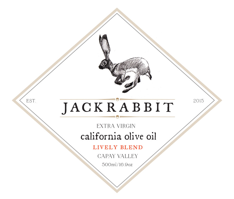
Naming, identity, label and drawing for John’s awesome award winning Extra Virgin Olive Oil grown in Capay Valley.


Naming, identity, label and drawing for John’s awesome award winning Extra Virgin Olive Oil grown in Capay Valley.
The one where we channel San Ju’s favorite artist…
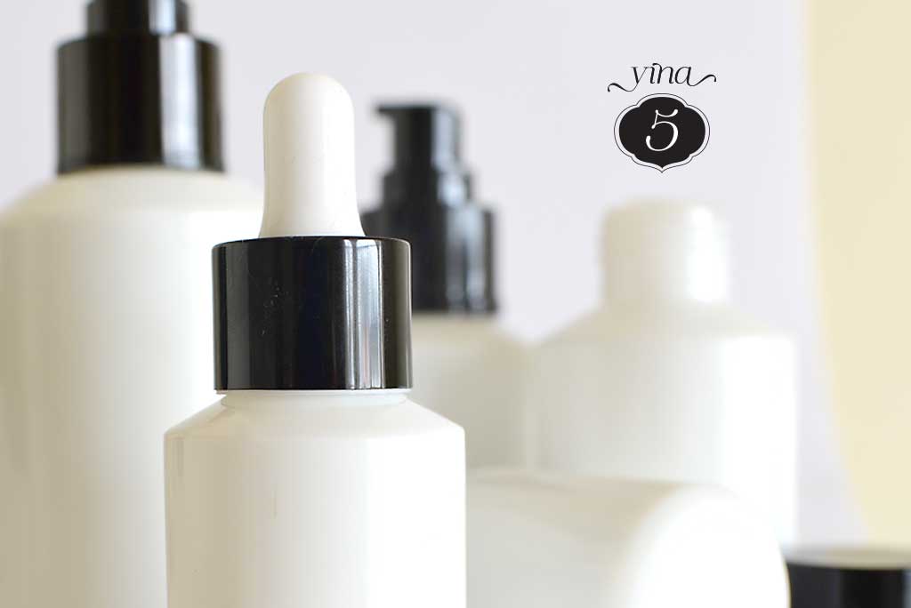
Early stages of a brand new beauty product line.
A local (Noe Valley) preschool is fundraising to extend to upper grades. They needed a new logo that “reflected” their values — unfussy, supportive, hands-on education.

for his art + furniture from his new machine.
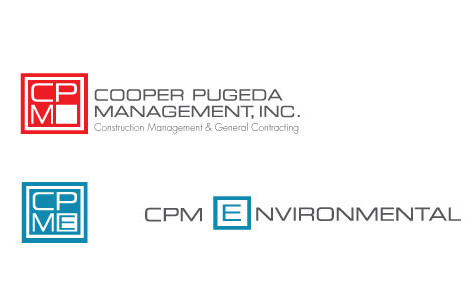
Cooper Pugeda needed their logo and branding updated for their over-all company, as well as creating a related branding system for specialized branches.
 ACI needed to update their brand. Their client base being upscale, they wanted a cleaner, minimal look that more reflected their approach and that has the flexibility to work in a variety of uses.
I love working with Amanda and the other Leslie :). They have a great sense of style, fun and humor.
Sometimes even with new clients it feels like you’ve been working together a long time. It’s that alchemist thing that keeps coming up.

Regard IP, (an intellectual property law firm) needed a fast identity and web presence for their new SF office. They had some interim cards printed at dependable letterpress, so I used the letterpress aesthetic as a jumping off point to create this logo. From there we put together an introductory website to expand as they grown, a custom email campaign template and stationery system.

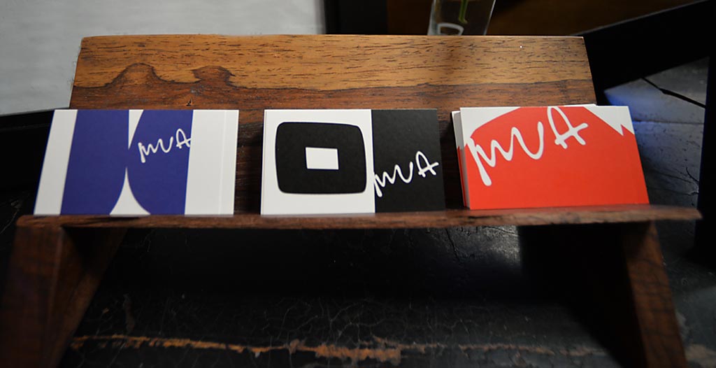
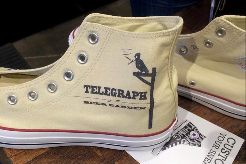
First round prototypes are fun, this one is for the sister restaurant to Mua Oakland
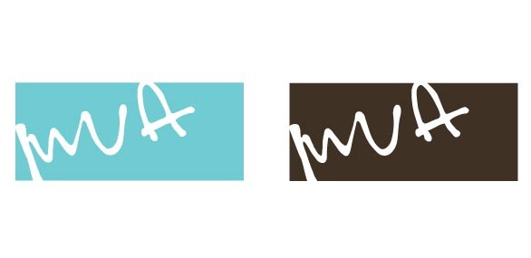
This logo for Mua is based on the graffiti style signage that used to be on the front of the restaurant. The city of Oakland thought it was a tag and painted it over!
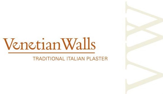
Todd Merrill and Peter McCandless needed a new identity for their traditional Italian wall treatment company, Venetian Walls. This design references a type-style of old Venice, but playful.

Designer Steve Livingston and Project Manager Joan Livingston wanted an identity for M8, their innovative technology that allows the easy swapping out of cabinet facing. The logo needed to work very small to be stamped on metal as well as larger for stationery and signage. They requested that it invoke the whimsical side of their personalities and gave the sense of changeability.
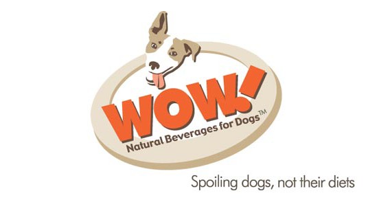
WOW! Natural Beverages for Dogs. A product under development, Duncan Macnamara requested an identity for his company that was warm and engaging, as well as eye-catching. I based the artwork on his amazing dog, Buddy.
This wasn’t logo design as much as a corralling and standardizing of all the many different versions of “Bistro Soizic” that exist.